Credion AG
Credion AG is a Hamburg-based consulting company that supports its clients in the financing process with the intention to meet the needs of companies and investors alike.
We are responsible for the new brand identity as well as for their website-relaunch and support the company continuously in website support and online marketing.
Credion AG wanted an enhancement of its existing branding to an unchanged serious but clearly more modern appearance.
In the sense of an evolutionary optimization, our design concept deliberately picks up elements of the previous design, but reduces them to its essentials. For example, the logo and color scheme are kept at their core, but are enhanced by two bright accent colors.
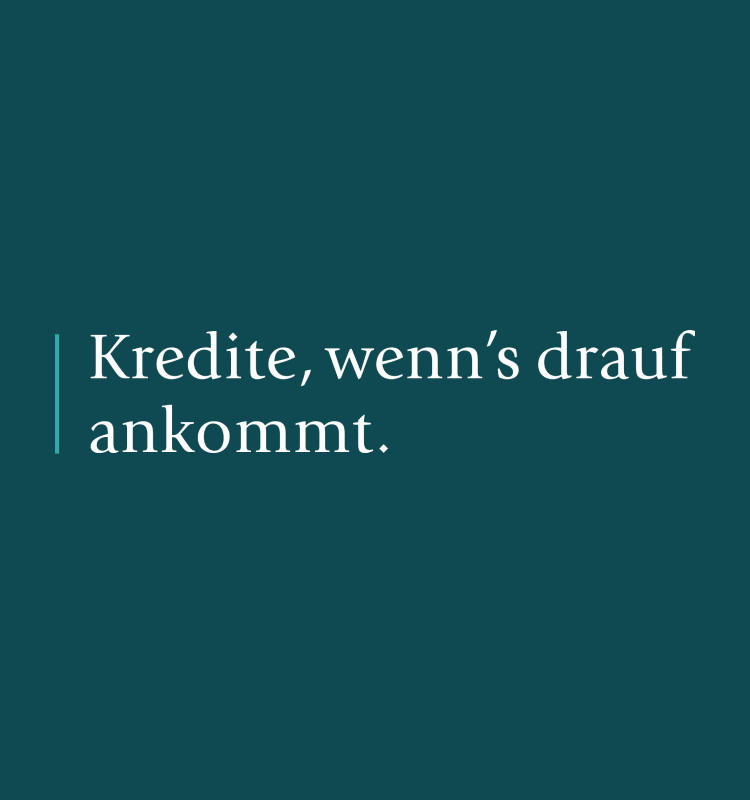
In addition to the classic ITC Giovanni, the sans-serif Case is used in the future. This font not only underlines the modern character of the new look, it was also chosen because it is easy to read on screens. The new imagery, with its stringent black-and-white look and rough grain, has an almost documentary feel, but lends vibrancy and independence to the otherwise rather clean look.
The result is a memorable brand identity that needs little to make an impact. In its understated elegance, it conveys clarity and seriousness and convinces with an eye-level approach.


Credion AG wanted an enhancement of its existing branding to an unchanged serious but clearly more modern appearance.
In the sense of an evolutionary optimization, our design concept deliberately picks up elements of the previous design, but reduces them to its essentials. For example, the logo and color scheme are kept at their core, but are enhanced by two bright accent colors.
In addition to the classic ITC Giovanni, the sans-serif Case is used in the future. This font not only underlines the modern character of the new look, it was also chosen because it is easy to read on screens. The new imagery, with its stringent black-and-white look and rough grain, has an almost documentary feel, but lends vibrancy and independence to the otherwise rather clean look.
The result is a memorable brand identity that needs little to make an impact. In its understated elegance, it conveys clarity and seriousness and convinces with an eye-level approach.


The simplified page structure, which is optimized for generating leads, focuses on Credion's financing products. On specially designed landing pages, general data and product benefits, including their three-stage inquiry process, are explained. Also, website visitors are encouraged to get in touch through prominent call-to-actions.

In addition to subtle animations and micro-interactions, we use a set of icons on the website and in marketing materials, which was especially developed for Credion AG. By visually underlining text content in this way, we increase the joy of use and strengthen the brand's recognition value.


You’re planning a digital project or want to promote your business digitally? Then let’s get to know each other.
