Poggenpohl
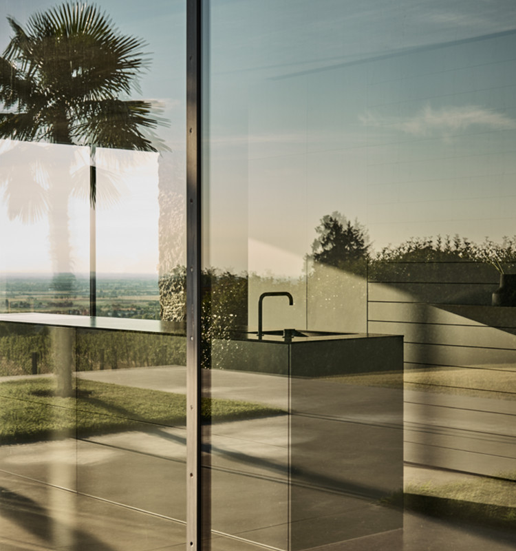
On occasion of the 125th anniversary of one of the world’s most traditional kitchen brands, we developed a microsite that brings back the past while providing a glimpse into the future.
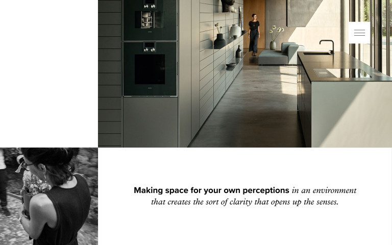
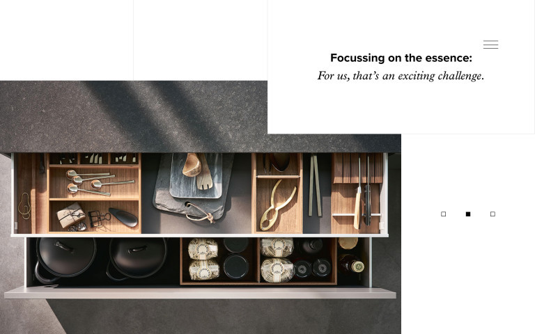
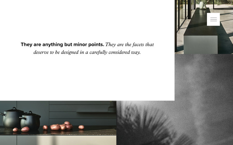
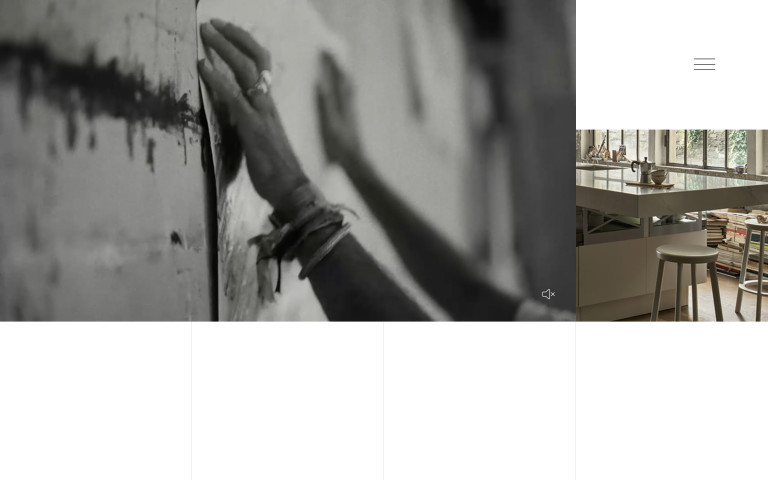
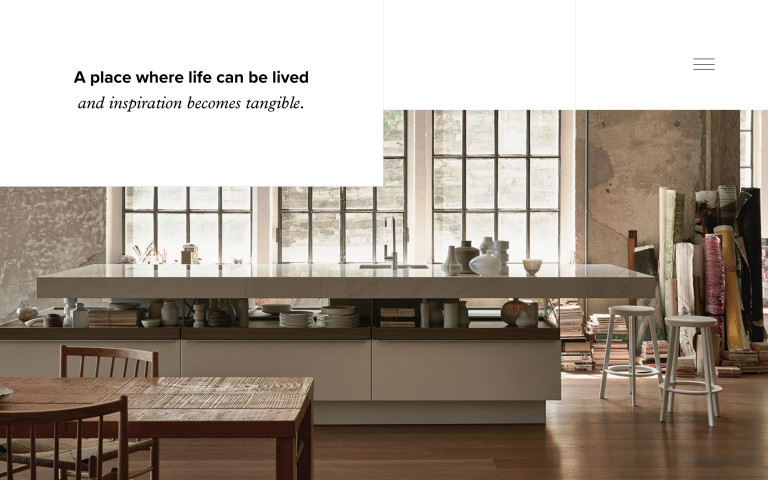
The most important milestones of the Poggenpohl company history are what open the doors to the microsite. On the homepage you scroll through these in chronological order until reaching the present day (bottom of the page). There, you’re presented with two new kitchen series. A click on one of the two teasers takes you deeper into the page and directly to the selected product.
We tell the story on two layers: products are presented in color and large format, supplemented by black and white snapshots that emotionally charge the product communication. This impression is reinforced by the fonts used: on the one hand a factual, informative grotesque, on the other a light-looking italic.
By combining these elements, a visually exciting page layout emerges that guides visitors through the story. The adaptable layout grid is reinterpreted on every subpage, thus ensuring variety.
The combination of these elements creates a visually exciting page layout that guides visitors through the story. The variable layout grid is reinterpreted on each subpage to ensure variety.
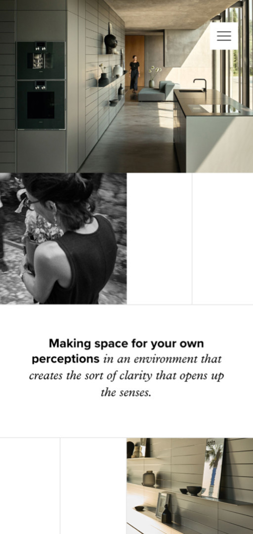
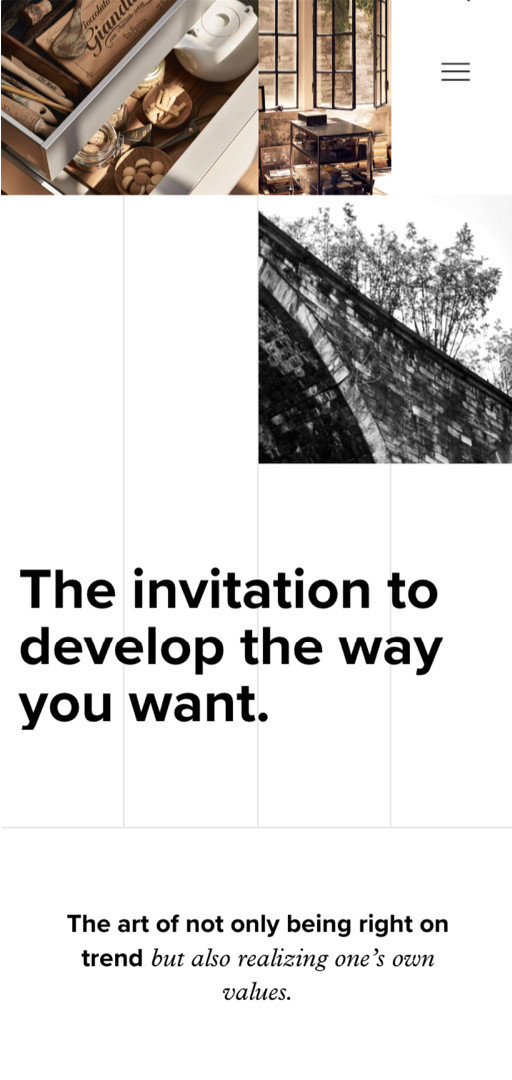
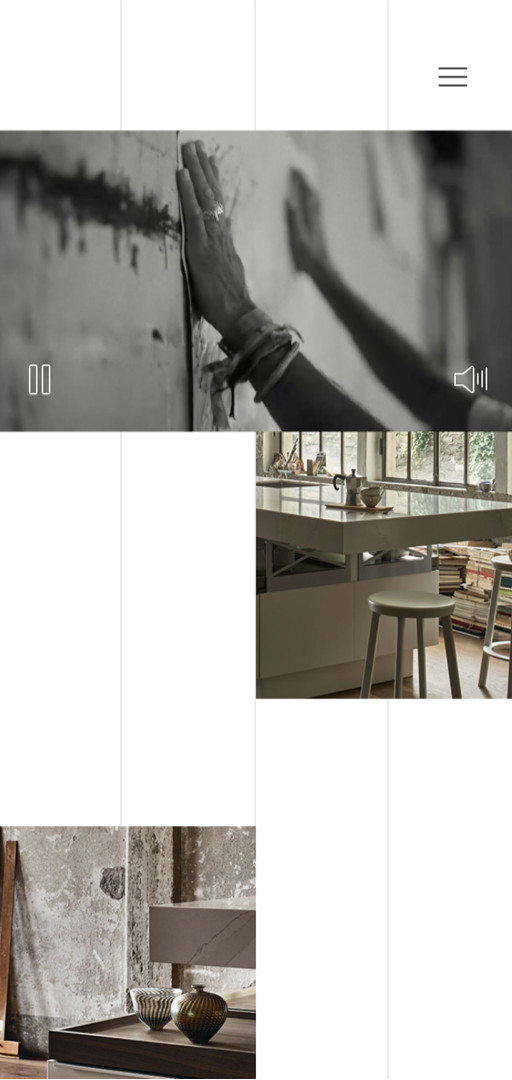
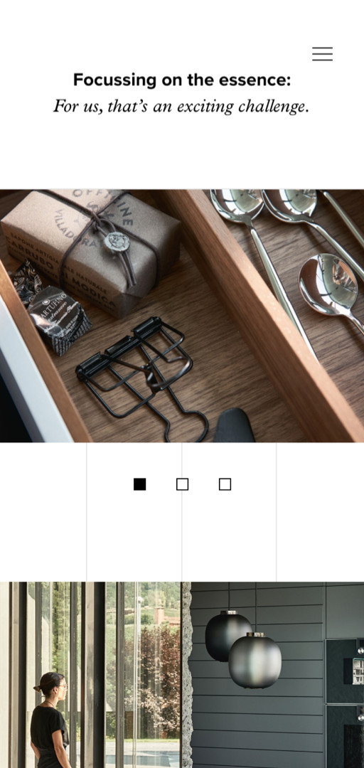
With this microsite, we’ve managed to create a unity of product communication and storytelling and to interweave the two in an unusual way.
On the occasion of the 125th anniversary, we staged a visually stunning film loop for the Poggenpohl in-house exhibition parallel to the microsite. To this end, we took up the mechanics of the two narrative levels again and transferred them to a video wall consisting of nine large-format screens.
You’re planning a digital project or want to promote your business digitally? Then let’s get to know each other.


