Thies Rätzke Images
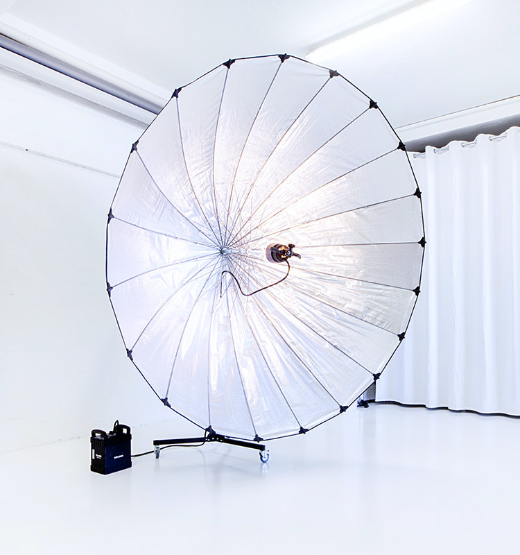
Initially a small studio in Hamburg's Schanzenviertel, Thies Rätzke Images has grown over the years into a full-service provider in and around corporate photography and film.
In order to communicate this change to the public, we completely redesigned the existing branding including the website.
The existing branding including the word mark was also developed by us and even won the renowned Red Dot Design Award in 2013.
New design requirements resulting from the reorientation made a revision necessary. After a detailed examination of the current appearance, we decided to only slightly adjust the existing color palette and to continue to rely on a word mark: The modified "Ä", whose reduced form is reminiscent of a tripod with a camera, remains.
Supplemented by a diagonal line grid and an individually developed icon set, a self-confident, industrial-looking look was created, which is also reflected in the design of the studio rooms.


The new website impresses with its clearly structured layout and the mixture of large-format photos and simple typography. The design is deliberately restrained and allows the content to take precedence. Projects are categorized and given an individual color scheme via the website backend, which underlines the individual character of each photo series.


As before the relaunch, the color scheme is still dominated by gray tones. A bright yellow as a high-contrast accent color dominates the design of the business stationery and is used in digital applications for highlights and call-to-actions.
Stationery


With the consistent further development of the existing design, we have succeeded in giving the appearance of Thies Rätzke Images an adequate, contemporary look. Positive user feedback and increasing conversions following the relaunch are a nice and an important confirmation of this.
I have a long-standing partnership with Convoy. The cooperation with the entire team is super nice and the results are consistently extremely high level.


You’re planning a digital project or want to promote your business digitally? Then let’s get to know each other.
