Wattmate

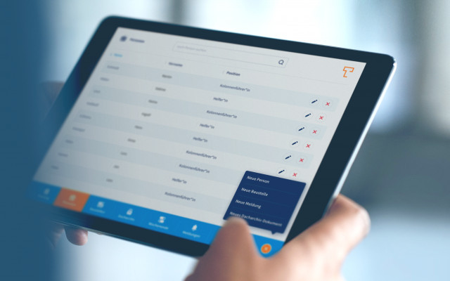
We developed a web platform for PNE AG that helps operators of small wind and solar parks to market their electricity efficiently and independently. Wattmate digitizes the brokerage process for power purchase agreements and combines it with personal support.
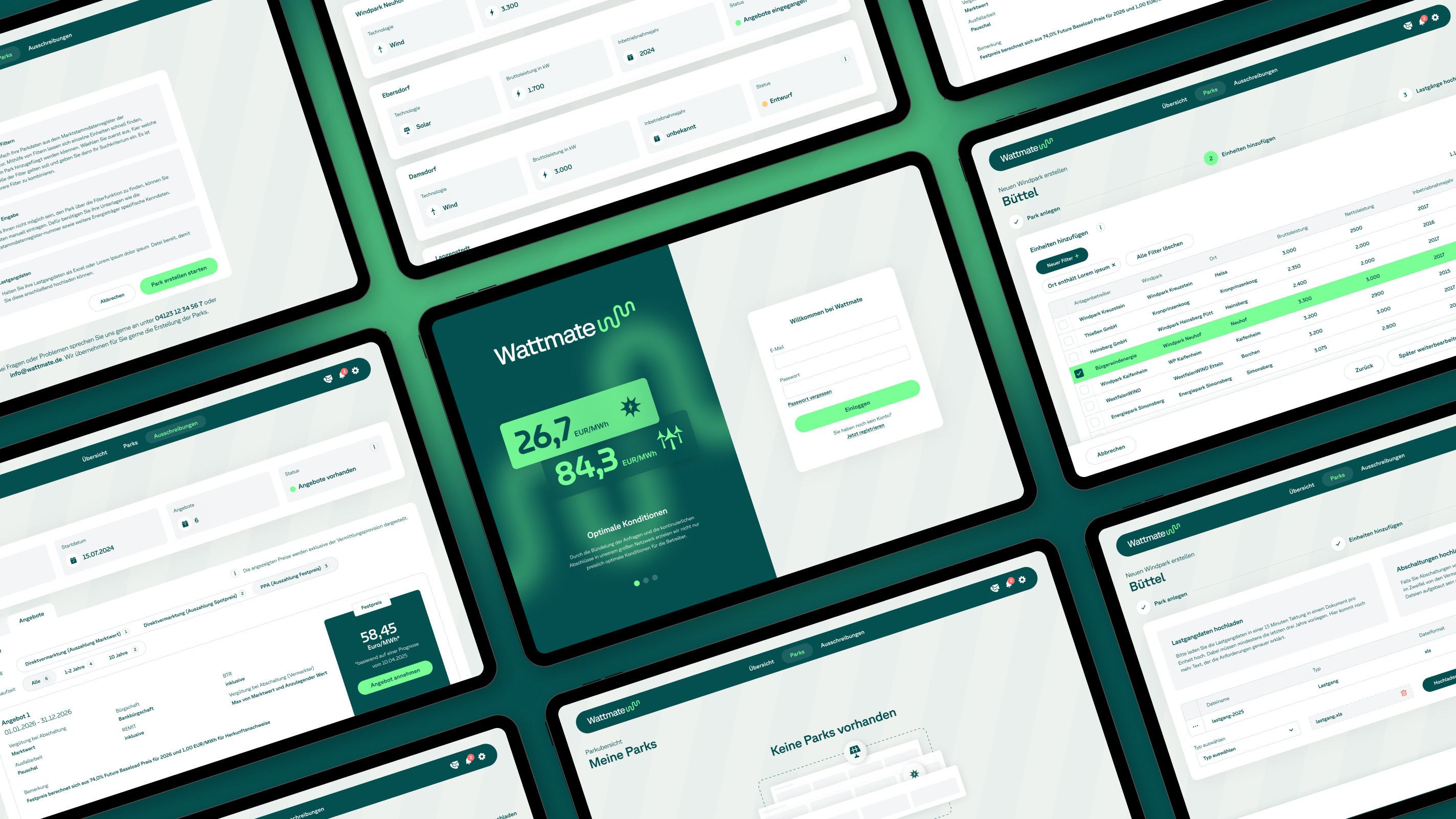
For Wattmate, a distinct brand was developed, combining technical precision with human accessibility. The name “Wattmate” stands for energy and partnership. It is simple, memorable, and approachable.
The implementation as a scalable web application is based on the open-source framework Laravel, supplemented by Livewire, Tailwind, and Alpine.JS. Market master data is automatically integrated and load profiles are analyzed via specially developed interfaces. The visualization of costs and contract processing are also carried out entirely via the platform.


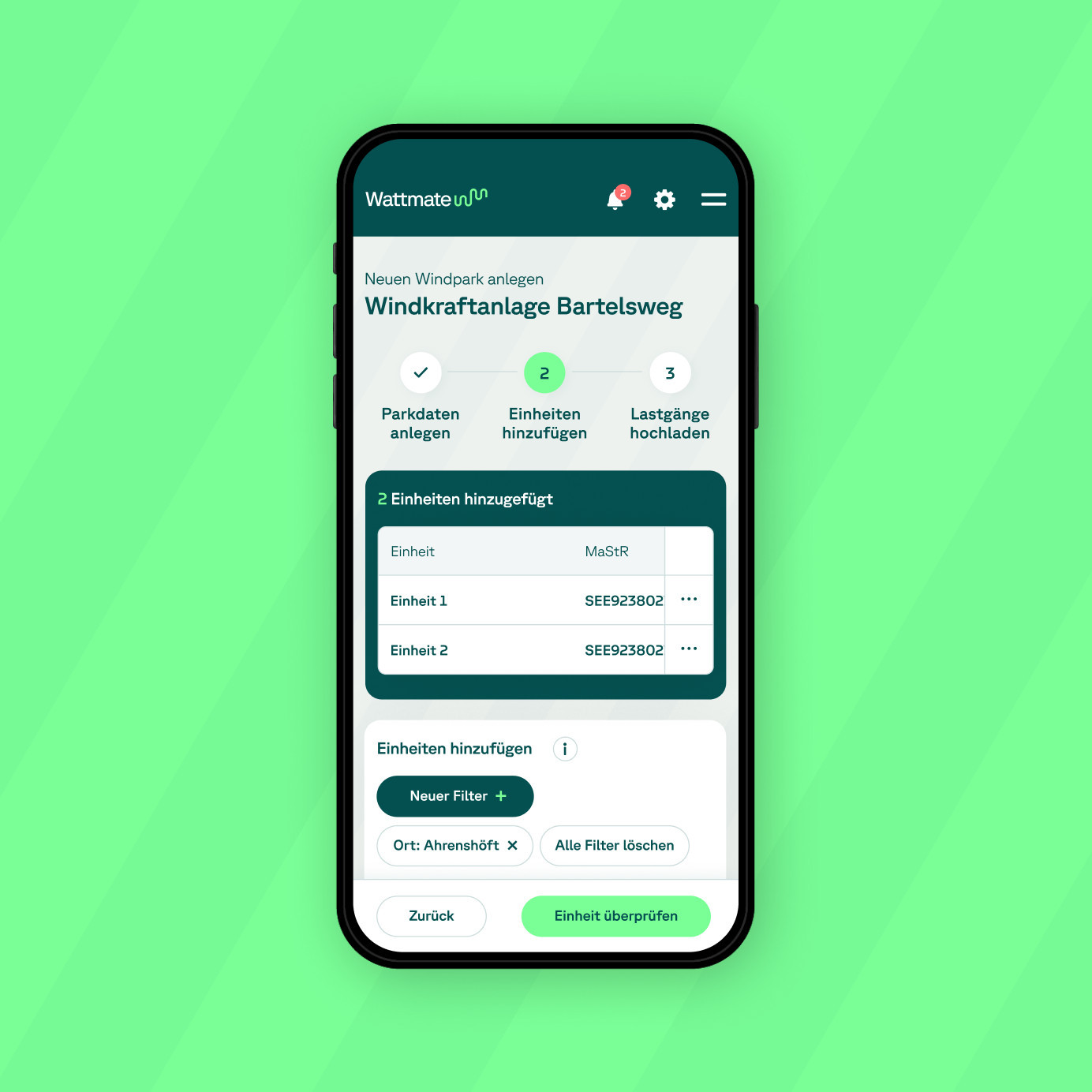

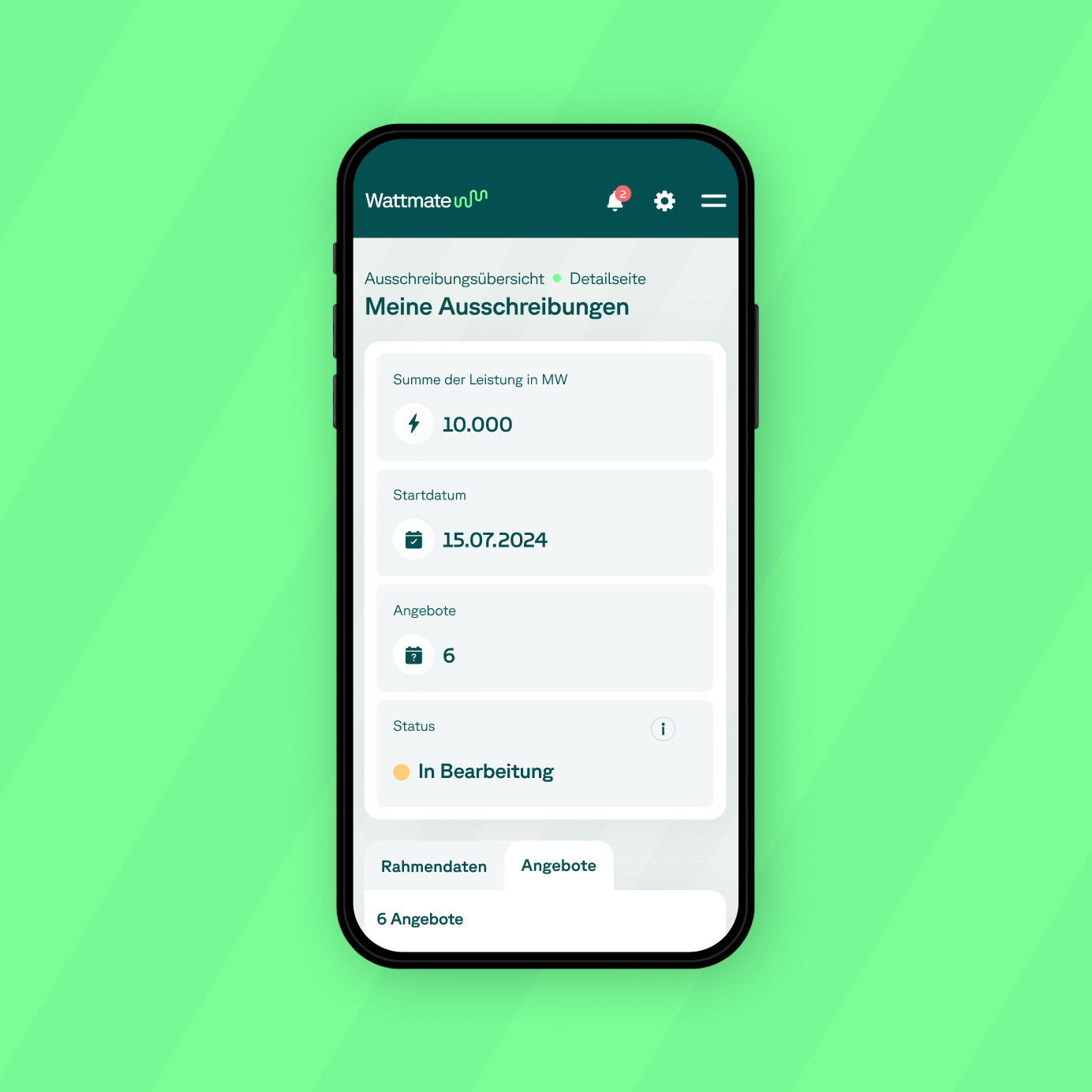
From the start, Wattmate was consistently designed from the user's perspective. The aim was to translate the complexity of electricity marketing into a clear, understandable user journey.
The application combines digital self-service functionalities with personal advice, making a challenging topic intuitive to use. Structure, trust, and orientation were at the heart of all UX decisions.
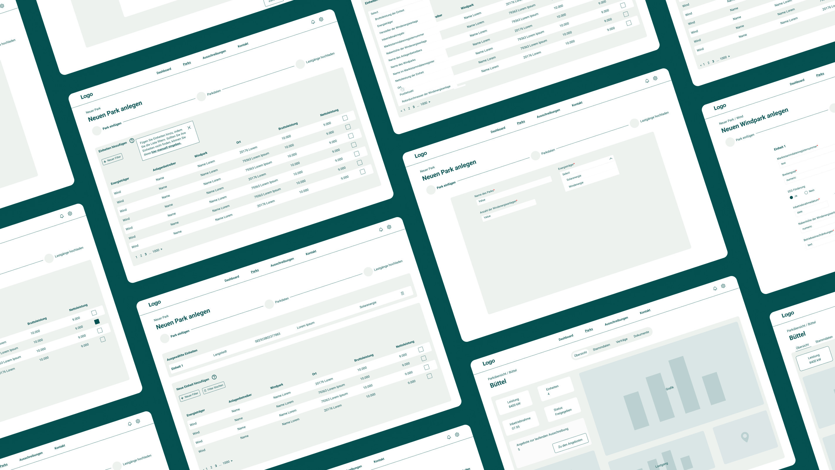
Wattmate's interface design conveys competence without overwhelming the user. Visual clarity, reduced use of colors, and a well-thought-out information hierarchy ensure a consistent, focused look. Interactive elements and data visualizations support decision-making processes within the application in a smart and subtle way. The UI design was mainly optimized for tablets and desktops, but thanks to its responsive design, it works just as well on mobile devices.
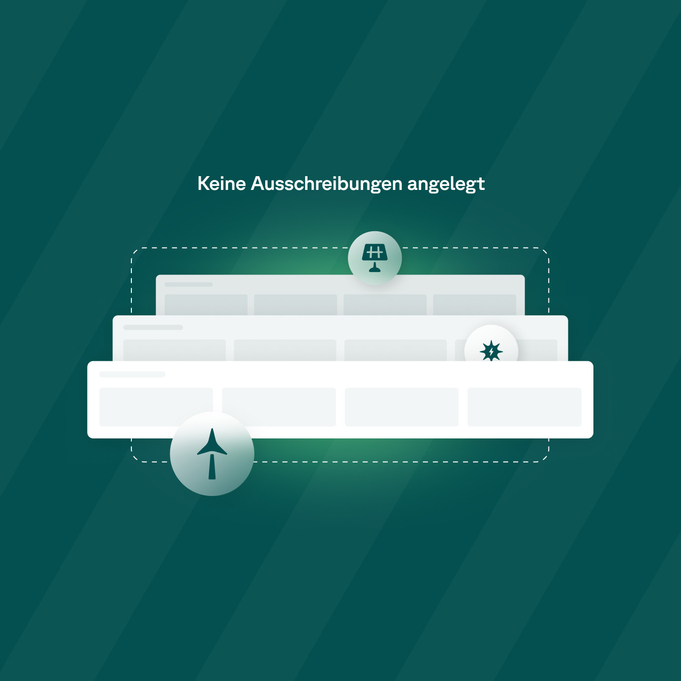
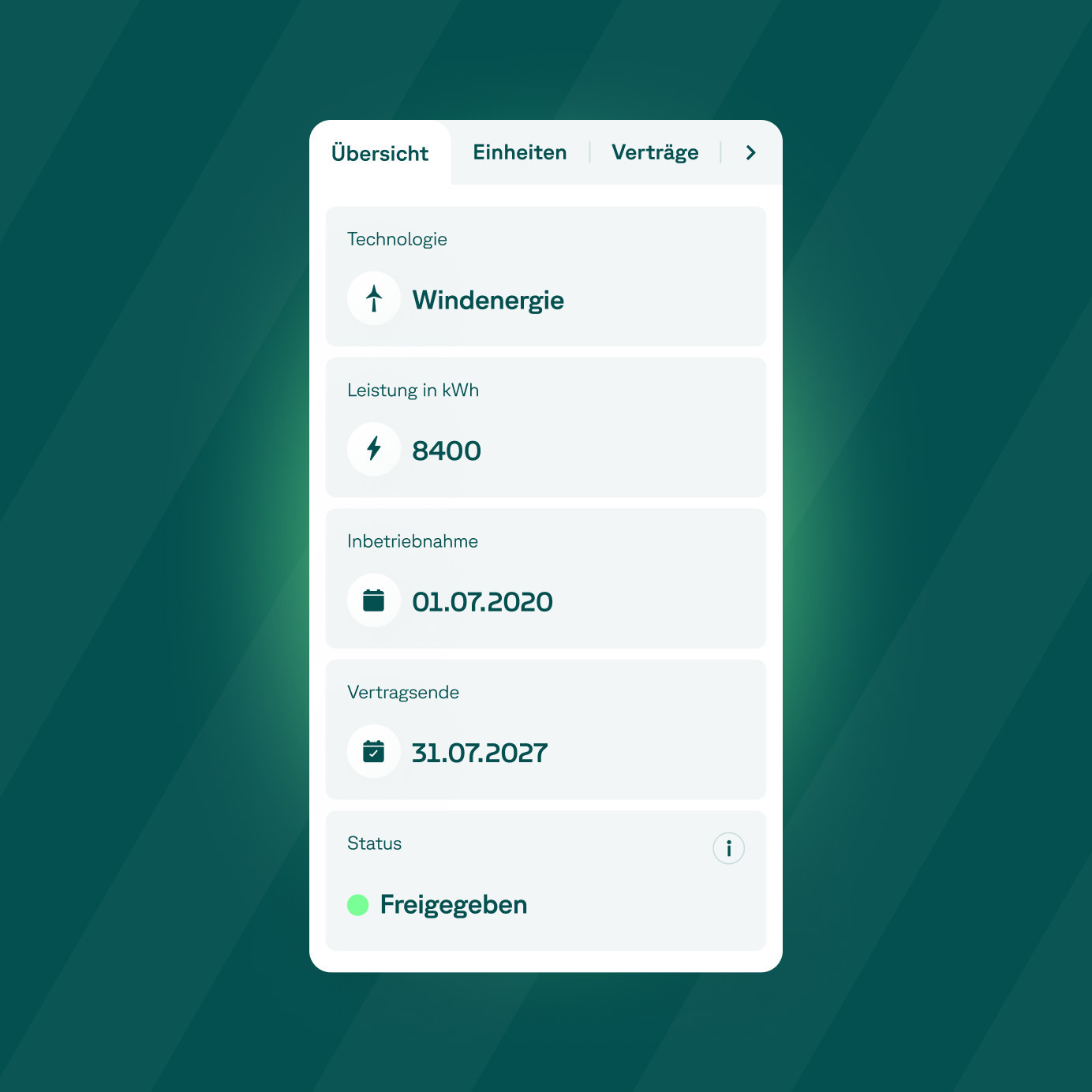
The visual identity is based on a specially designed logo, a completely AI-generated visual language, and a clear color concept consisting of just a few shades of green. The logo combines the letters W and M to form an abstract, wave-shaped figurative mark that evokes dynamism, connection, and data flow. The result is a brand identity that is memorable and inspires confidence.


With Wattmate, we have created a platform that focuses on usability and clearly aligns our brand with our value proposition: simple, transparent, and customized electricity marketing. Convoy supported the project with a deep understanding of the market.
You’re planning a digital project or want to promote your business digitally? Then let’s get to know each other.


